Understanding Colour in Landscape Photography
6 COLOUR RULES I FOLLOW IN LANDSCAPE PHOTOGRAPHY
INTRODUCTION
Many photographers focus on dramatic light or striking locations, but colour often plays an equally important role in how a photograph feels. In my own editing process, I spend a great deal of time refining colour relationships and making sure the final image reflects the atmosphere I experienced in the landscape. I like my photographs to feel colourful and expressive, but never artificial.
I know there are photographers who may not agree with my approach to colour, because my images do not always follow what would be considered perfectly balanced or neutral tones. For me, colour is the most important part of the editing process and it often helps reinforce the composition that already exists in the landscape. It is the stage where I express how I felt in that moment. It is also the language I use to describe how I see the world.
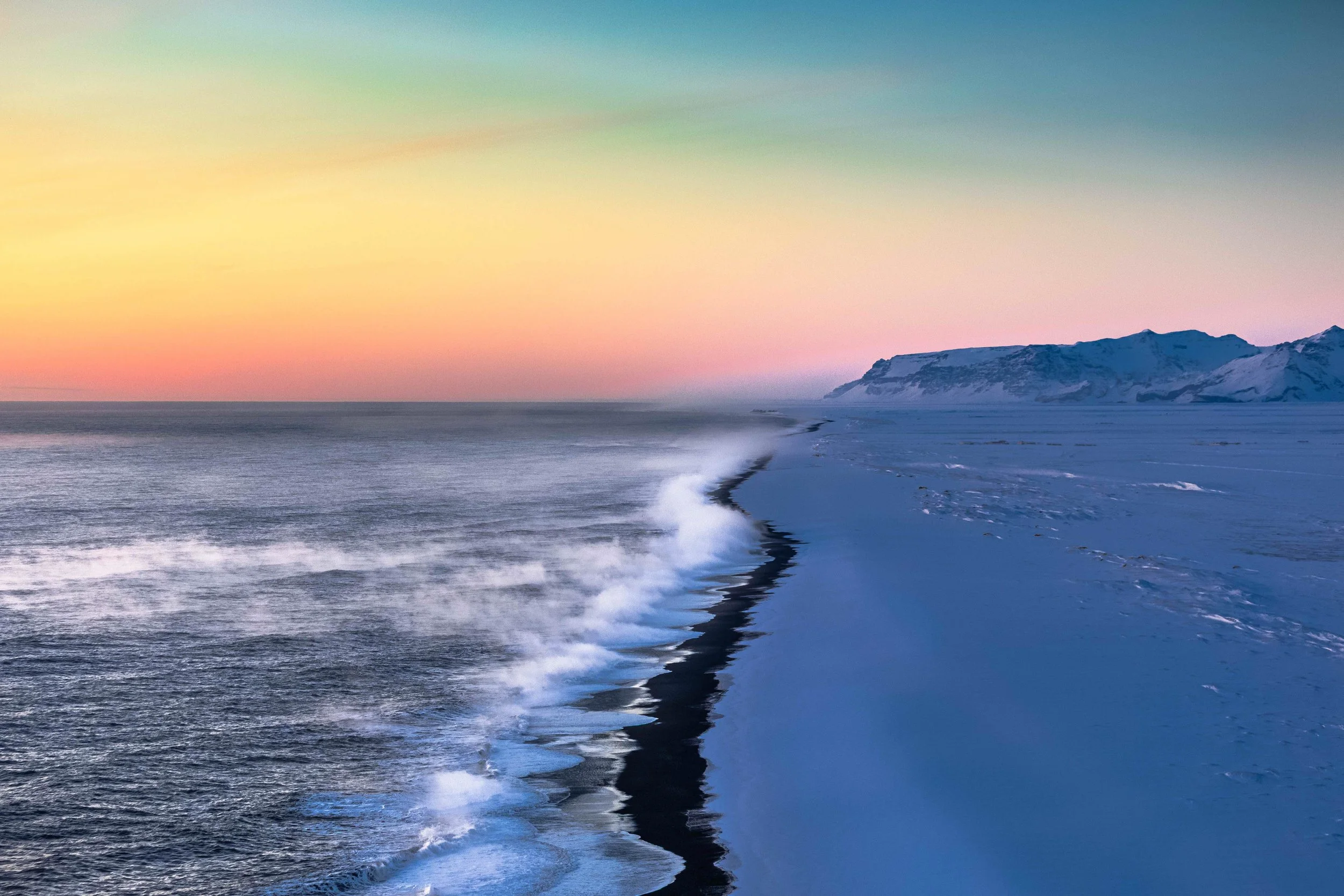
Subtle colour transitions across layered mountains during sunset in Iceland.
In the field, when I explore the landscape, I am very sensitive to even the smallest shifts in tone. After dusk, the sky can turn from orange to pink and eventually fade through hundreds of shades of blue. I always try to restore that feeling in post-production. I feel that I am not exaggerating it, because those colours were truly there, even if they are not always obvious when I first look at the raw files.
Over time I have developed six colour rules that guide the way I edit my photographs.
Enjoying the article? I share more of my photography and thoughts about colour, light and landscapes on Instagram.
Rule 1 – Colour Should Match the Atmosphere
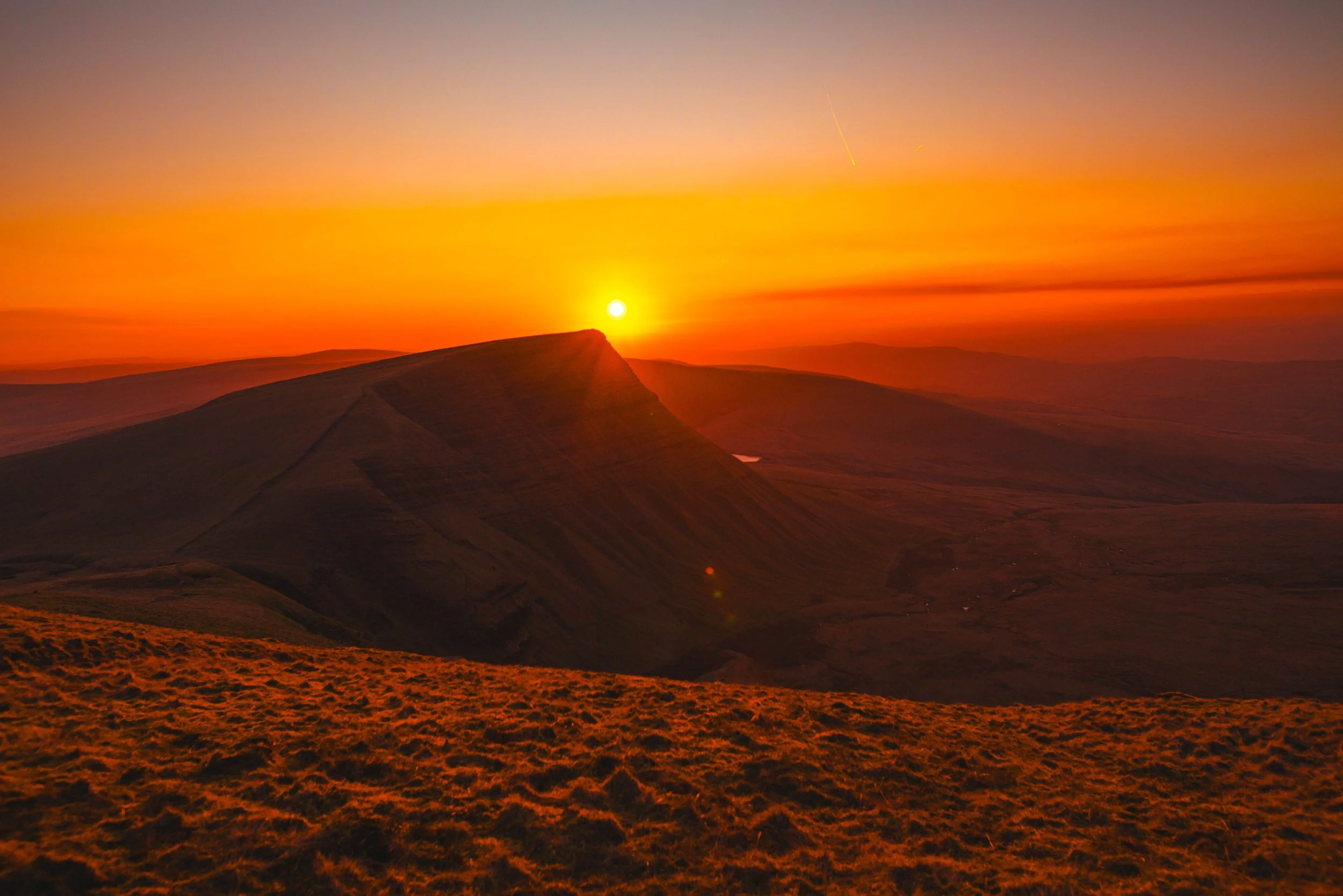
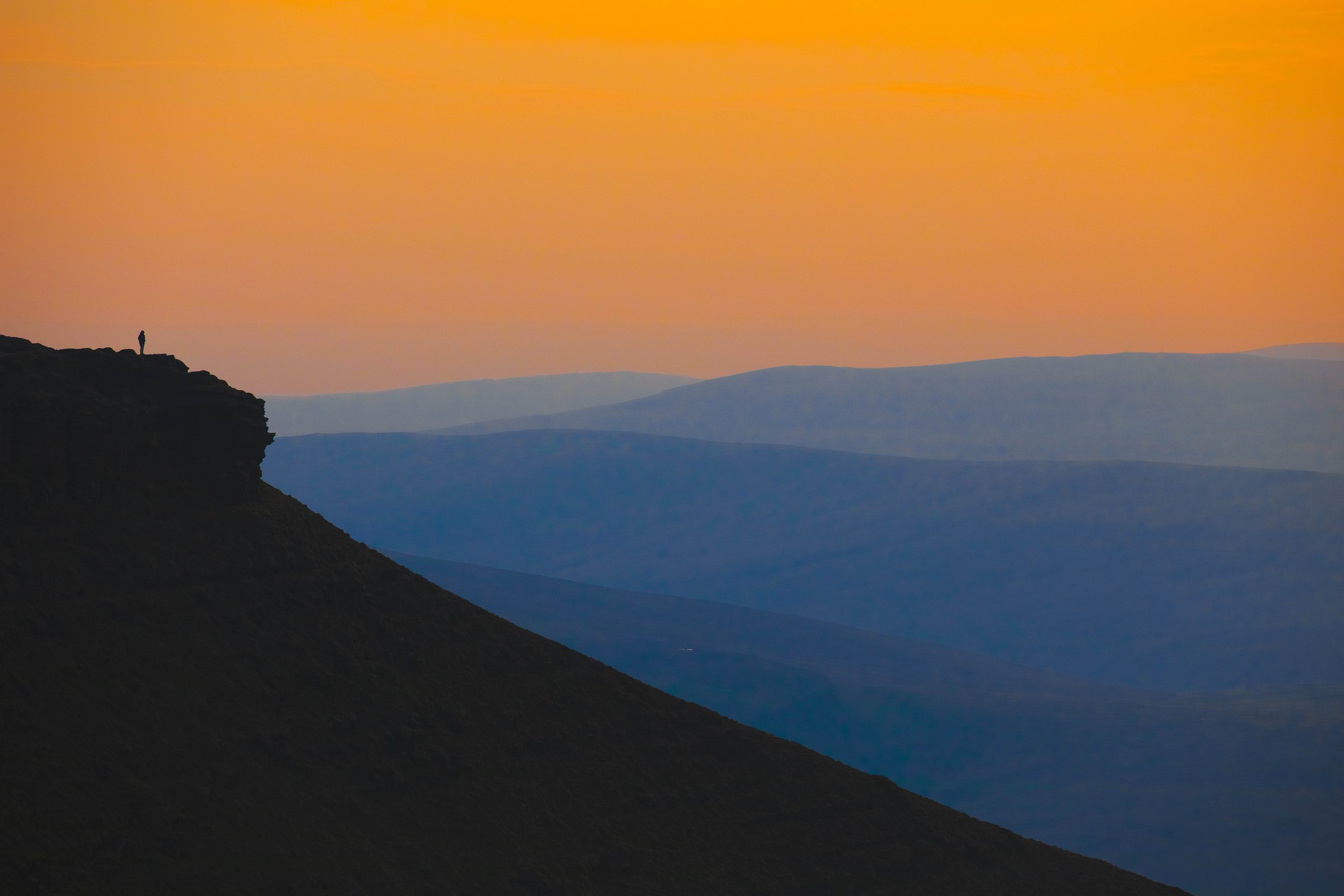
Warm sunset light naturally fills the landscape above Llyn-y-Fan-Fach in the Brecon Beacons, Wales
One of the first things I pay attention to when editing a photograph is the atmosphere of the moment. Colour should always reflect the light conditions that were present when the image was captured. If the scene was warm and glowing during sunset, the colours should carry that warmth. If the light was cold and muted on an overcast day, the photograph should keep that cooler feeling.
Sunset is a good example. When the sun is close to the horizon, the landscape naturally fills with warmer tones. Mountains, clouds and even shadows begin to shift towards orange, red or pink. When editing these images I try to preserve that warmth rather than neutralise it. Correcting colours too aggressively can easily remove the very atmosphere that made the scene interesting.
For me the goal is not to make colours perfectly balanced, but to make them believable. The photograph should still feel like the moment I experienced in the landscape.
RULE 2 – STRONG COLOUR DOES NOT MEAN HIGH SATURATION
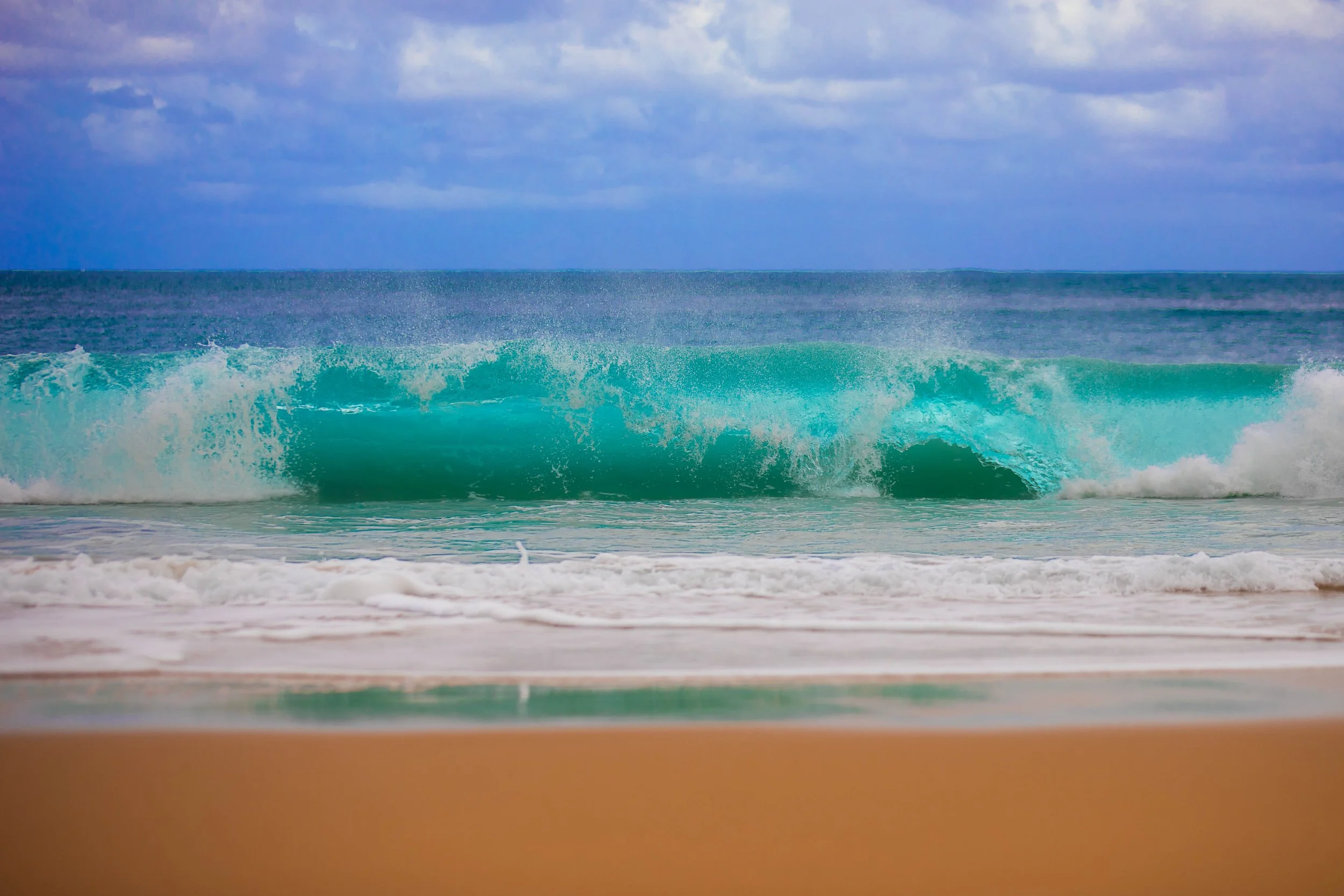
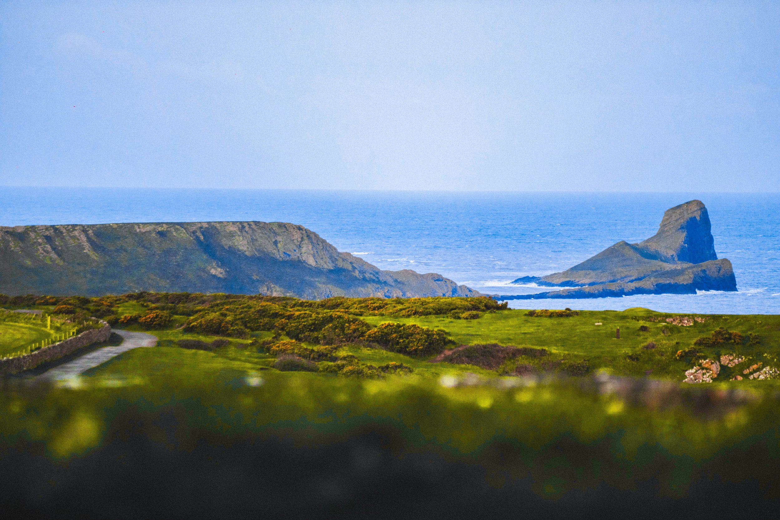
Natural colour contrast between turquoise water, soft sand and muted sky without excessive saturation, Kauai Hawaii.
One of the most common mistakes I see in landscape photography is the belief that stronger colour simply comes from increasing saturation. In reality, saturation alone rarely improves a photograph. When colours are pushed too far they often lose their natural depth and start to feel artificial.
For me, strong colour comes from the relationship between different tones in the image rather than from their intensity. A photograph can feel colourful even when the colours themselves are not overly saturated. What matters more is how those colours interact with each other across the landscape.
During editing I often focus on small adjustments rather than global saturation. Subtle changes in vibrance or selective colour adjustments usually work much better. They allow certain tones to become more expressive without overwhelming the entire image. This keeps the photograph colourful while still preserving a sense of realism.
RULE 3 – BALANCE WARM AND COOL COLOURS
Warm sunset tones contrast with cooler blue mountain layers in the Brecon Beacons, Wales.
One colour relationship I pay close attention to is the balance between warm and cool tones. In landscapes this contrast appears very naturally. Warm sunlight often touches parts of the scene while shadows remain cooler and slightly blue. This contrast between colour temperatures helps create depth and separation in the photograph.
A simple example is a mountain illuminated by warm evening light while the valleys or shadows remain cool. That difference in temperature gives the image structure and helps guide the viewer’s eye through the scene.
I also follow one simple rule when working with these contrasts. Opposing tones should never be saturated at the same level. If warm and cool colours are both pushed equally, they begin to compete with each other and the image can quickly feel chaotic. One of the tones should always dominate slightly while the other supports it. Keeping that balance helps maintain harmony while still allowing colour contrast to give the landscape depth.
RULE 4 – AVOID COLOUR THAT FEELS ARTIFICIAL
Colour and contrast help guide the viewer through the landscape towards the sea stack, Rhossili Bay, Wales.
When I edit a photograph, I always try to stay alert to the point where colour begins to feel artificial. Landscapes already contain an incredible range of tones, and it doesn’t take much adjustment to push them beyond what feels believable. Once that happens, the photograph often loses the quiet atmosphere that made the scene interesting in the first place.
Greens are usually the first colour that can become unrealistic. Moss, grass or vegetation can quickly turn too bright or fluorescent when saturation is pushed too far. The same often happens with skies. Deep blue skies can easily become exaggerated during editing and start to look heavier than they ever appeared in reality.
Another place where colour problems appear is in the shadows. When shadows are lifted too aggressively, colour noise and strange tones often start to appear. This can make the image feel unstable even if the rest of the photograph is well balanced.
For me, subtlety almost always produces a stronger result. When colours remain restrained, the viewer focuses more on the atmosphere of the landscape rather than on the editing itself.
RULE 5 – USE COLOUR TO GUIDE THE VIEWER
A narrow band of light across the ridge naturally draws the viewer’s eye through the landscape, shot on film.
Colour can help guide the viewer through a photograph, but in my images it usually works together with light and composition rather than leading on its own. When I look at a landscape, the first thing that often draws my attention is the direction of light or the structure of the scene. Colour then strengthens those elements rather than replacing them.
For example, a warm patch of sunlight on a mountain can naturally become the focal point of the image. The colour is not what creates the composition, but it helps emphasise it. The contrast between that warm light and the cooler tones around it gently directs the viewer’s eye towards the most important part of the frame.
During editing I sometimes make small adjustments to support this relationship. I might slightly strengthen the warmth of the light or soften colours in less important areas. The goal is not to make colours louder, but to help the composition feel clearer and more balanced. In this way colour becomes another tool that works alongside light, shape and structure in the landscape.
RULE 6 – SOMETIMES RULES NEED TO BE BROKEN
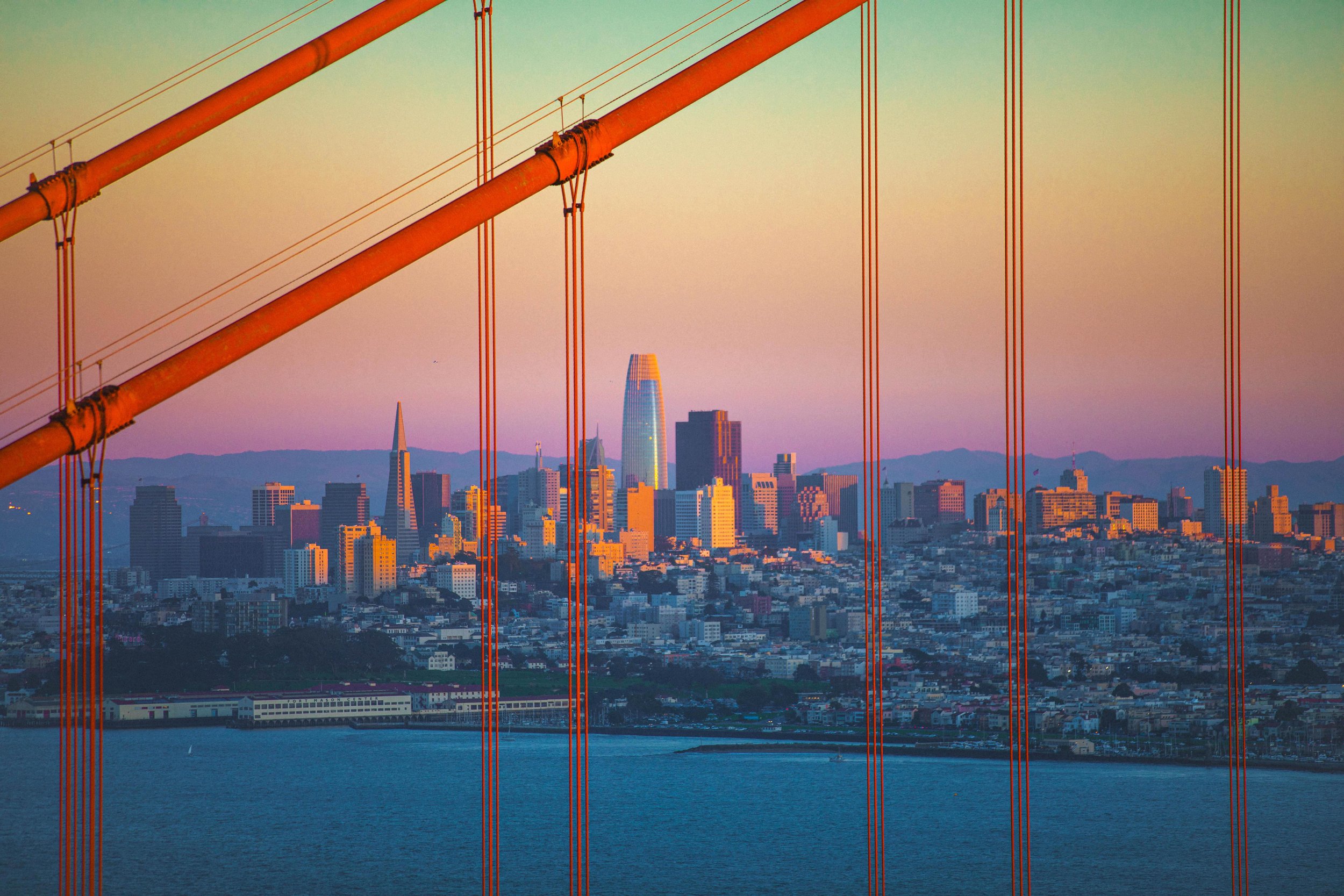
Sometimes strong colour helps express the atmosphere of the moment more honestly than trying to keep everything perfectly balanced, Golden Bridge, CA, USA.
Even though I follow these rules most of the time, I do not treat them as strict limitations. Photography is not a technical exercise where every image needs to follow the same formula. Every landscape and every moment of light is different, and sometimes the photograph asks for a slightly different approach.
There are moments when stronger colour can help express the atmosphere of the scene. Around pink hour, the landscape can briefly take on unusual tones that disappear just as quickly as they appear In situations like this, I allow colours to become slightly more expressive, because capturing the feeling of the moment can be more important than keeping everything perfectly balanced.
For me, these rules are meant to guide my editing rather than control it. Creative decisions will always matter more than strict rules. The goal is not to follow a system perfectly, but to create photographs that still feel true to the experience of being there.
CONCLUSION
Colour is not just decoration in a photograph. It plays a significant role in shaping how we experience a landscape. The way colours interact can influence the atmosphere of an image just as much as light, composition or scale.
For me, editing colour is not about inventing something new. It is about revealing what was already present in the scene and restoring the feeling of that moment as faithfully as possible. When colour is treated with care, it becomes one of the most powerful ways to communicate how a place truly felt when I stood there.
If you’d like to share your perspective, let me know in the comments how you approach colour when editing your landscape photographs (:
Enjoying the article? I share more of my photography and thoughts about colour, light and landscapes on Instagram.